It had only been a week out of the basement office – where we started the company on a shoe-string budget – and into our newly renovated studio.
Nonetheless, we were excited.
We were asked to prepare a pitch presentation, like all the other agencies with this brief: We are creating an international boarding school on 20 acres of land with the name “Kimberley”.
Here’s what we came up with.
The brandmark (logo):
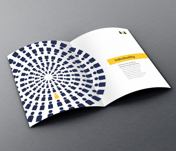
We created a typographic mark by playing with the letter “i” which symbolised individuality and intelligence. yellow added a sense of fun and creativity whereas a contrasting darker shade of blue delivered class, trust and tradition, making the equation complete.
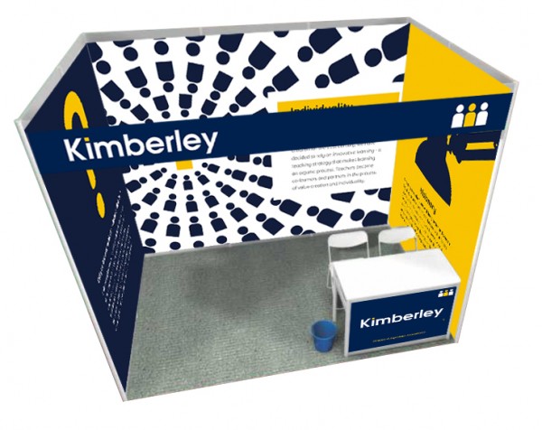
The AIGO theory
The dotted “i” needed an alies to partner it’s cause, to amplify it’s meaning and to simplify it’s story- to become a mouthpiece for all communication. the theory draws its roots from the school motto, which is an extension of the vision and promise of kimberley to its students and parents. The AIGO man became the face with a purpose to inspire young minds and connect ideas.


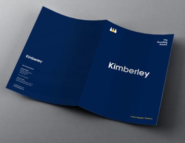
The brochure.
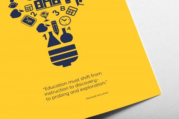
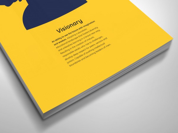
Typically, school brochures look-alike. the cute-pictures-of-kids-plastered on every page trigger nothing but mundane. our approach, however, was to do the exact opposite. no pictures of kids. That’s right. none.
Branding the campus.
Taking inspiration from the town Kimberley in South Africa, we created a unique voice for the school campus which embodied the Aigo spirit.
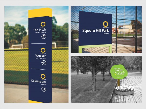
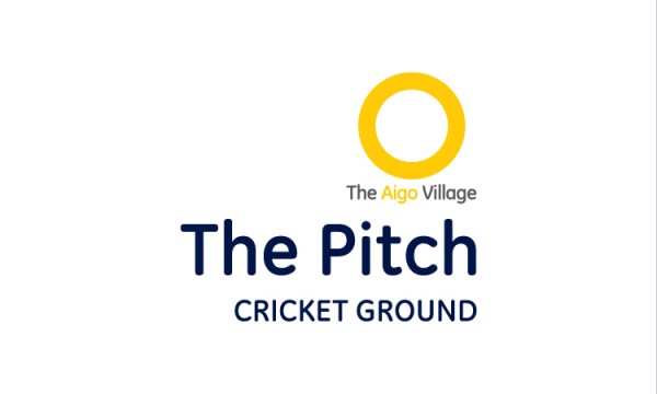

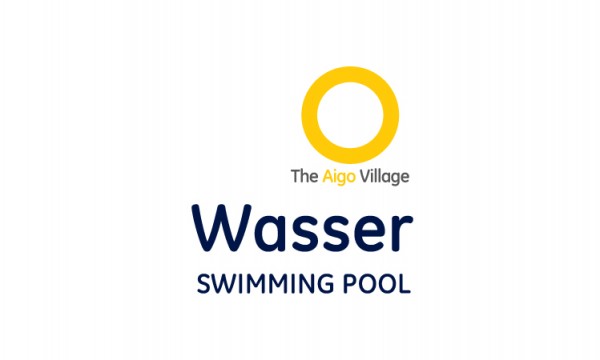
The school houses were also coined and developed to inspire young minds as well as build a cult-like following.