Our solution:
Layout:
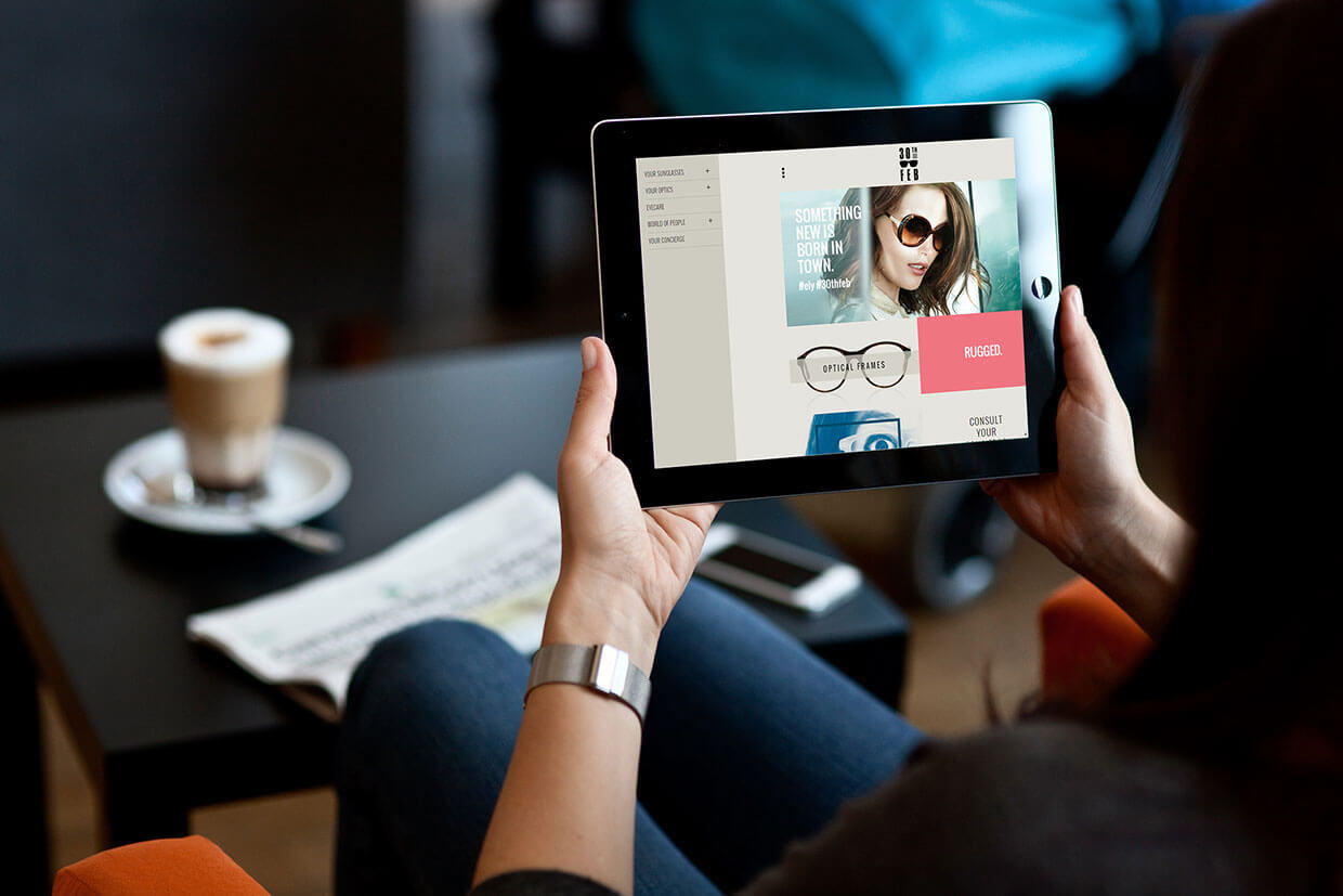
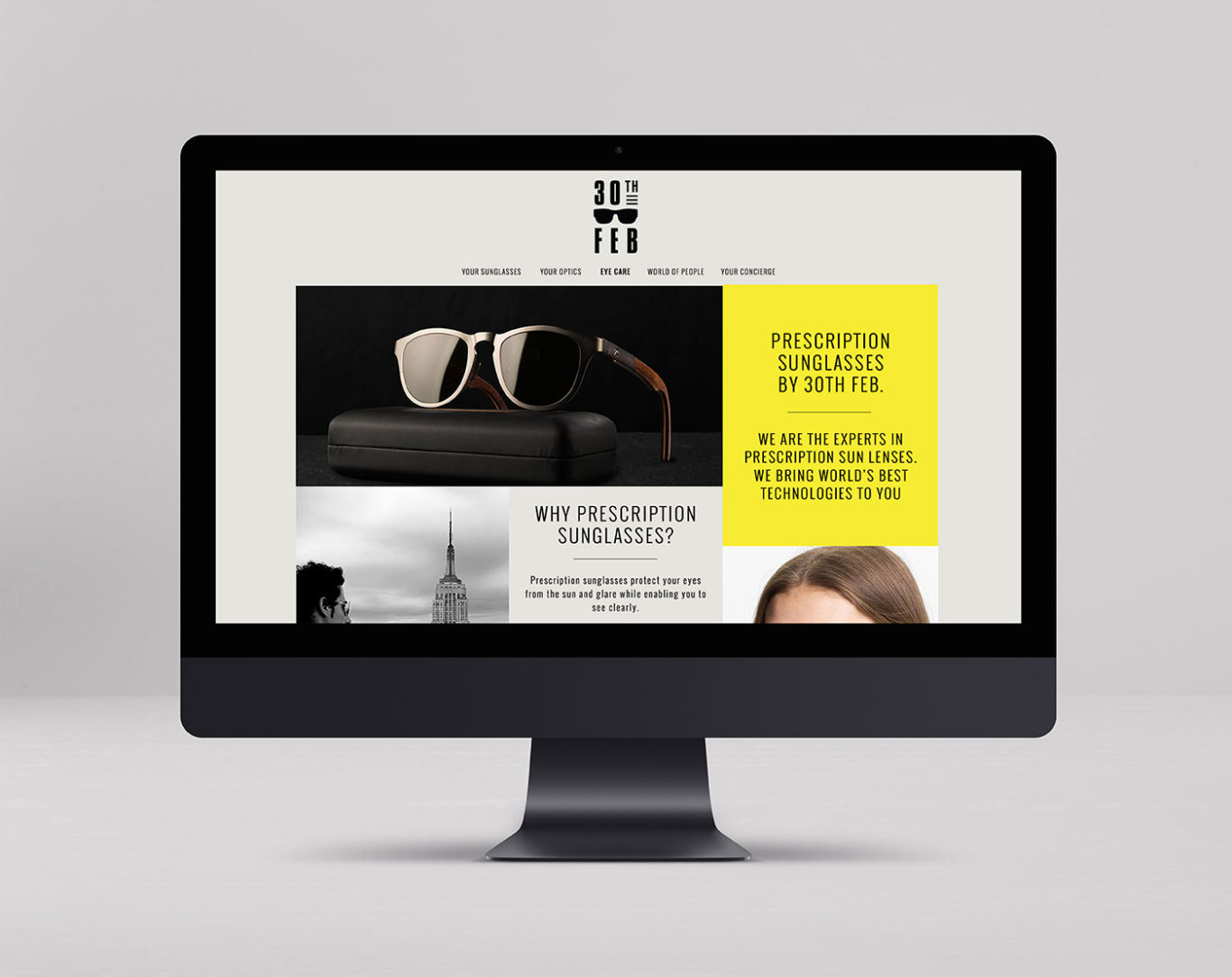
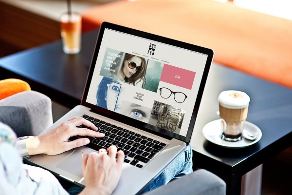
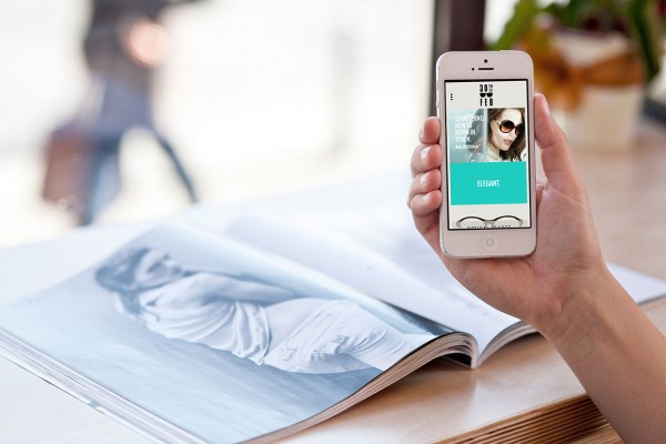
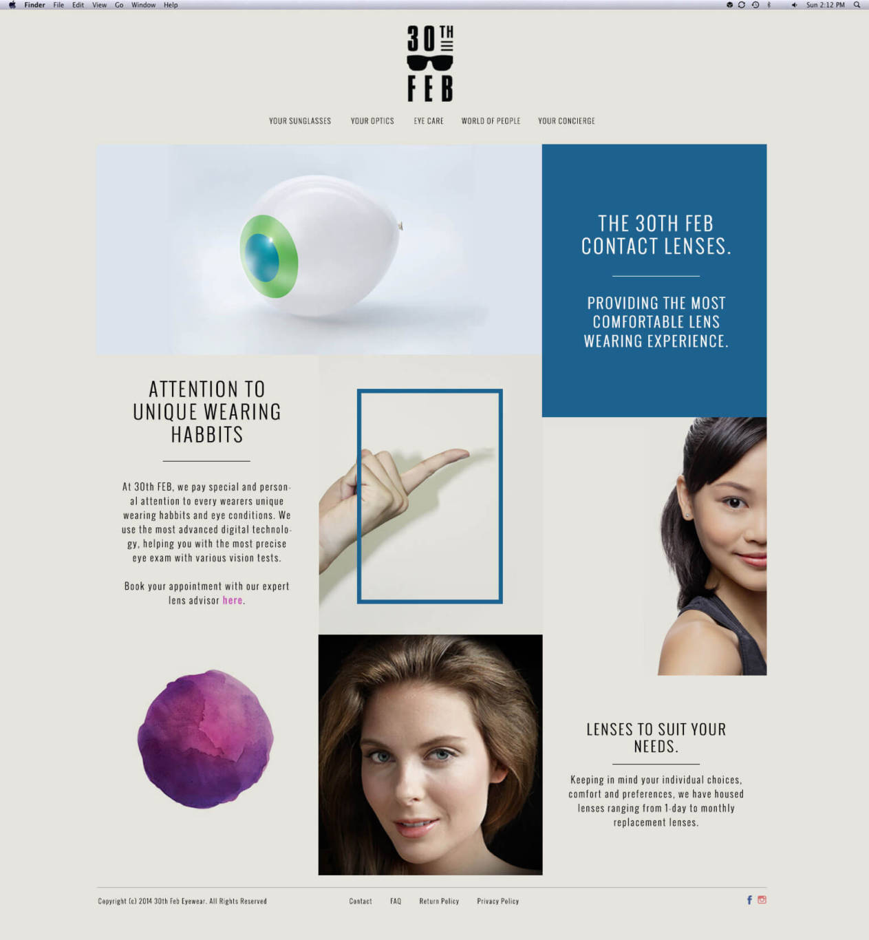
The layout has been kept very neat & clean . Even the content part has been kept to the bare minimum. We have used fluidic orientation & a responsive design i.e. the design and development responds to the user’s behaviour and environment based on screen size, platform and orientation.

Navigation & Pages:
For the wide screen on pc’s and laptops we have a drop down slide navigation in the menu for enhanced UX and an appealing UI design for the website. It gives a bit dramatic yet sophisticated feel to the website environment. In case of the tablet and phone orientation, the menu has been a left slide in one, a path navigation.
The brands have been depicted using their brand image to have a connect between the website and theirs, that proves more authenticity. The brand images have been directed to their parents website pages where people can know more about the brand and their collections, since they do not have a catalogue of our own.
