Naming Logo Stationary Packaging Presentation

We began work with the aim of creating a familiar and recognisable brand, easy to relate to and flexible for various product applications. our initial findings and research revealed numerous me-too brands with an aggressive competitive-price-based strategy. A clear distinction had to be drawn from the locally manufactured, inferior in design and quality, brands.


After discussing several possibilities and options, we zeroed in on “duravolt”, a short hand for durable voltage. the name reflects safety and long life, enabling the brand to build initial relation with prospective customers, vendors and distributors.
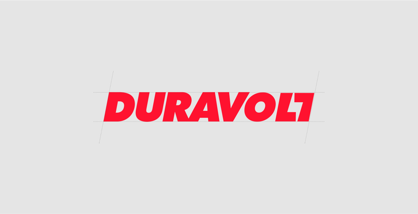
The next challenge was of designing an identity/logo capable of expressing an electrical switches company without limitations of execution.
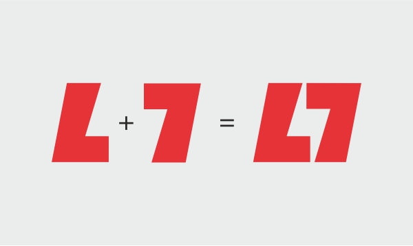
The negative space between the letters “L” & “T” creates a lightening bolt and the italicized letters add forward movement.
