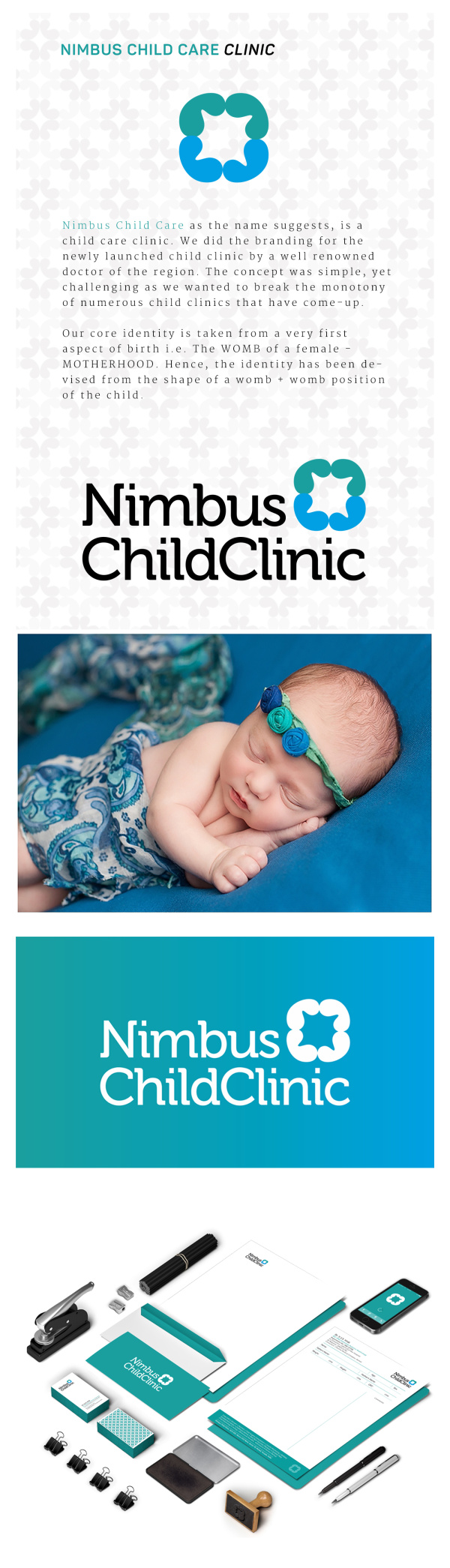
Nimbus Child Care Clinic as the name suggests, deals in child wellness and healthcare. We did the branding for the newly launched child clinic by a well renowned doctor of the region. The concept was simple, yet challenging as we wanted to break the monotony of numerous child clinics that have come-up.
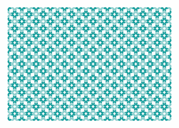
Our core identity is taken from a very first aspect of birth i.e. The WOMB of a female – MOTHERHOOD. Hence, the identity has been devised from the shape of a womb + womb position of the child.
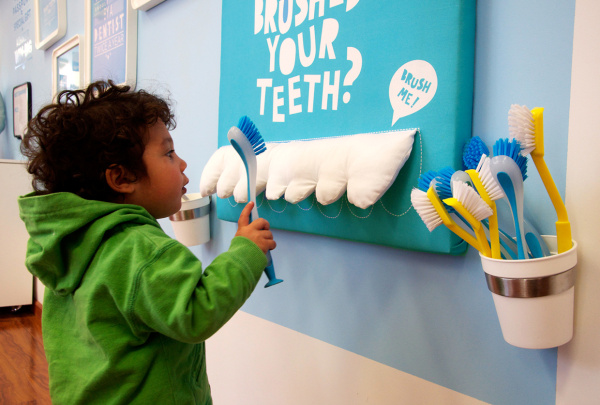
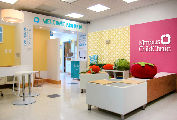
We came up with the overall branding for using the Teal and Blue colours that are soothing to the eyes, yet colours with characteristics of trust and wellness. An overall office branding was also created.